.jpg)
×
MoodBoard Info
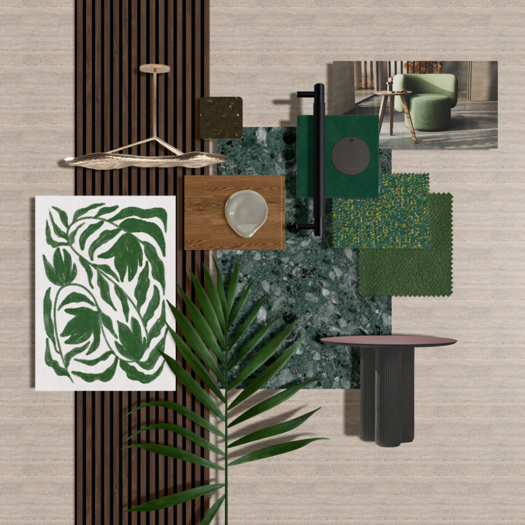
Verdant Harmony
A curated blend of nature-inspired design and tactile comfort: AW Bolete Table – Organic elegance meets functionality. LUUM Unbounded & Super Shearling – Textural depth with a soft, inviting touch. Ora B&T – Timeless craftsmanship with a modern edge.
Mocha Mousse
2025 New Colour of the Year Mocha Mousse Featured Products: Calm...
×
MoodBoard Info
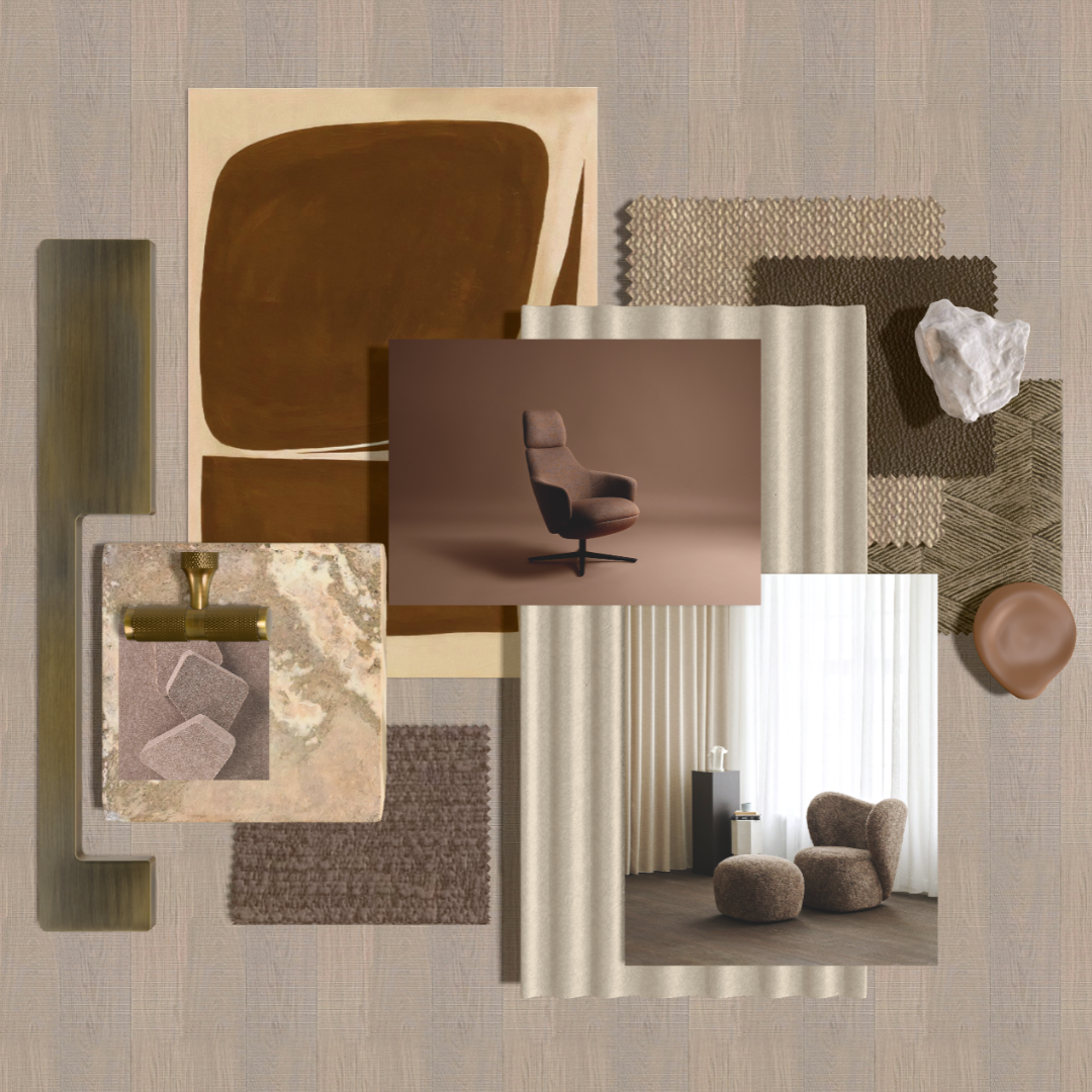
Mocha Mousse
2025 New Colour of the Year Mocha Mousse Featured Products: Calma Lounge - Andreu World Rationale - LUUM Archisonic Acoustics - Impact Acoustic Monotex - LUUM Big Big Chair - Norr 11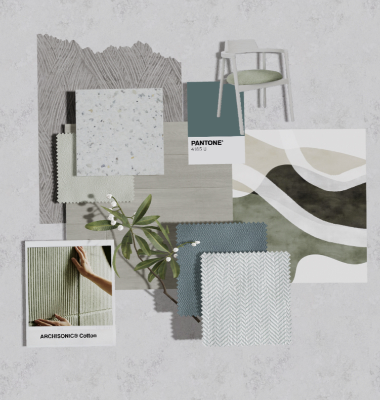
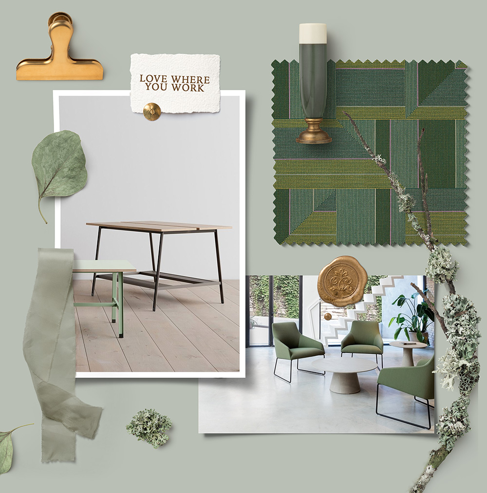
Green Forest
Featured Products: ARCHISONIC® Cotton - Impact Acoustic Herringbo...
×

MoodBoard Info
Green Forest
Featured Products: ARCHISONIC® Cotton - Impact Acoustic Herringbone Hybrid & Demi Boucle- LUUM Ocean- Smile Plastics Alek Chair- B&T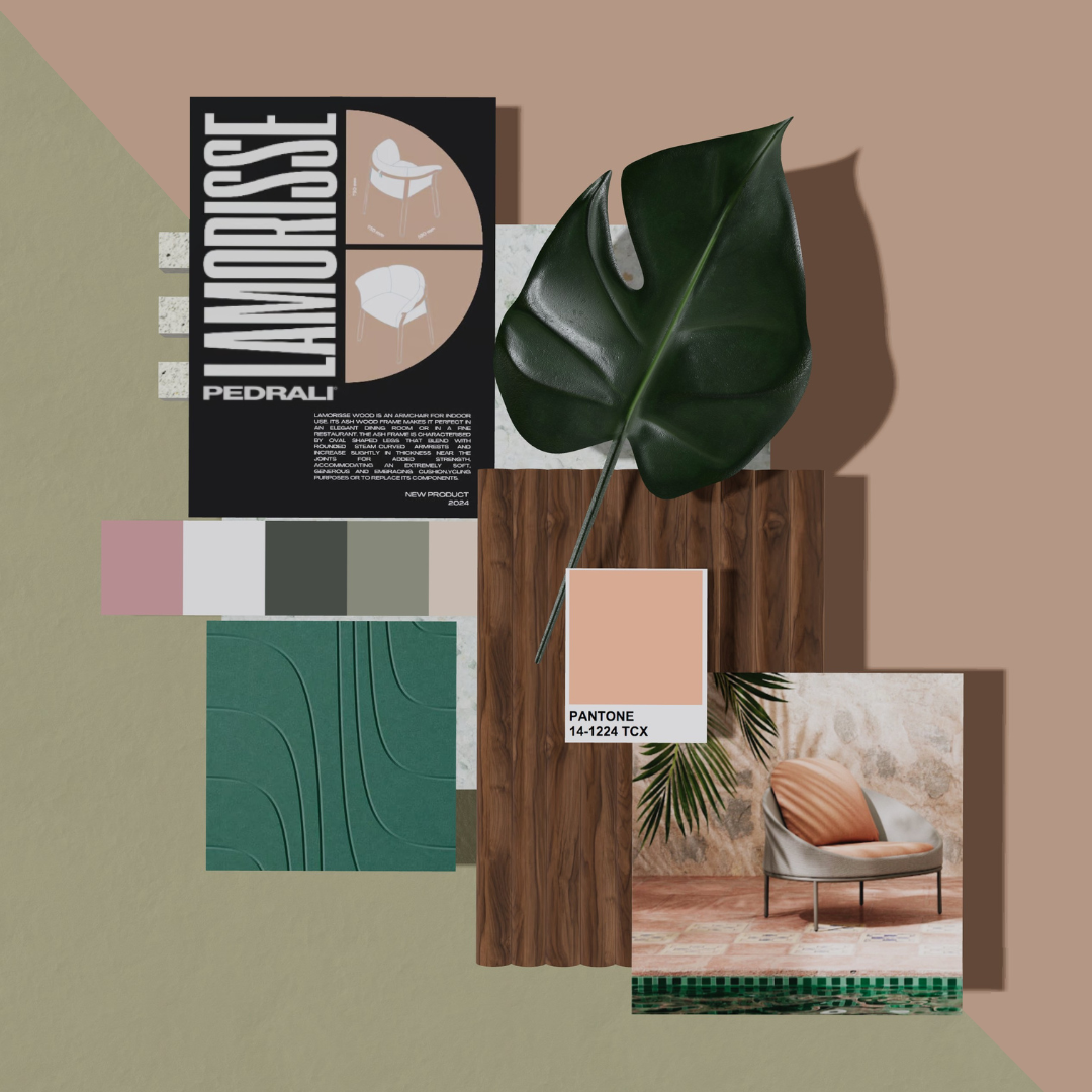
Coral Sands
Featuring Smile Plastics - Heron Green, Pedrali- Lamorisse and B&T- Do...
×

MoodBoard Info
Coral Sands
Featuring Smile Plastics - Heron Green, Pedrali- Lamorisse and B&T- Dor.png)
Peach Fuzz
~ Peach Fuzz ~ Keeping the trend with the Pantone color of the year...
×

MoodBoard Info
Peach Fuzz
~ Peach Fuzz ~ Keeping the trend with the Pantone color of the year (Peach), It's a mix of pink and orange, often a light and soft tone. As it's a warmer tone, it can help brighten your office space. Adding peach can help bring a summer glow to your space.Products
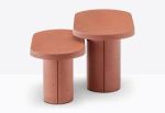
caementum
Patra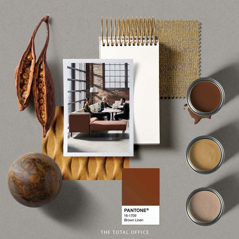
Sun & Sand
×

MoodBoard Info
Sun & Sand

Moss Green
Moss Green color can help achieve a botanical or nature-inspired inte...
×
MoodBoard Info
Moss Green
Moss Green color can help achieve a botanical or nature-inspired interior. Pairing it with almost any color, it can provide a fresh look which is great for any space such as collaborative areas, meeting rooms, or individual spaces._1.jpg)
Positivity has a color, and that’s Yellow!
positivity has a color, and that’s Yellow! All we are doing here is...
×
.jpg)
MoodBoard Info
Positivity has a color, and that’s Yellow!
positivity has a color, and that’s Yellow! All we are doing here is to prove the beauty of every color, and encouraging the use of vibrant shades. We definitely enjoy our little combination for this week, what are your thoughts on it? ???? . . . #lovewhereyouwork #moodboard #materialboard #yellow #greenProducts
Borough Lounge
Studio TK
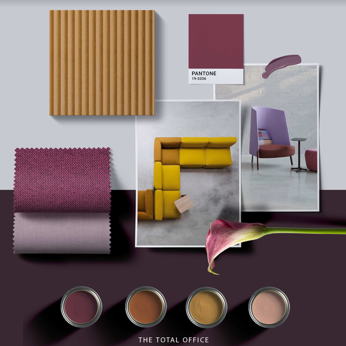
Lilly, the beauty!
This beautiful palette has been inspired from the different shades of ...
×
MoodBoard Info
Lilly, the beauty!
This beautiful palette has been inspired from the different shades of purple and yellow found in the Lilly flower which is an interesting mixture found in a naturally made element. Purple, a vibrant color has been combined with a cheerful color such as yellow could be used for a focal point area to make the space more interesting to look at.Products

Fractals
Studio TK
Future Tense Actuate
Luum Textile